


- Brand Strategy
- Positioning Strategy
- Tone of Voice Identification
- Art Direction
- Photography
- Creative
- Graphic Design
- Campaign Creation
- TVC
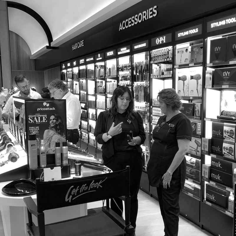
- Store Design
Price Attack
[row customclass="add-top-medium" fx=""][column customclass="white-txt" fx="" span="12" ]
[h3 customclass="white-txt uppercase heading medium-small-txt no-pad-bottom" ]Our role[/h3]
