


Mercy Ships is a charity that has in the past rested on its Christian laurels, which has worked well in the past. But, with census data showing religious sentiment being on a continual downward slide since the 1990’s, and a slew of other charities and causes popping up in recently, it was time to take another approach, and re-educate the market and client to a new way forward.
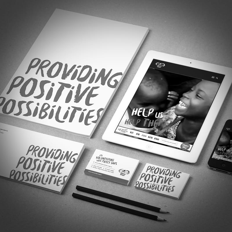
Our answer was to focus on the positive result of a patient visiting Mercy Ships, as positivity is non-secular, and speaks to people on a more universal scale. All executions feature happy smiling faces, to show the outcome of a happy interaction with the charity. Colour palette is based around the original brand colours of dark blue and green, with brush typography to further show how approachable and the personality of the brand.
Executions have covered print and digital (direct mail campaigns, Facebook ads, remarketing, website), and the outcome has been conclusive, with recent campaigns showing that, when compared to the previous year’s statistics, the number of donors has increased, as well as the value of each donation has increased, while the overall cost of the exercise was lower.
The key performance indicator is return on investment, with last year’s results showing an ROI of $24 for every dollar spent, compared with 2015 the results show $32 for every dollar spent, a 134% increase.
[/column][/row]
